The problem
Malaysians have more receipt apps than ever and none of them fit how people actually spend here. Global apps don’t know what a makan stall receipt looks like, can’t read Bahasa menu items, have no idea LHDN tax relief exists, and flatten everything into categories like “Dining” and “Transportation.” Local alternatives are either built for accountants or long dead.
So most people track their spending by… not tracking it. And then stressing about tax filing once a year.
CheqPls is the app I wanted for myself. Then I built it.
What it does
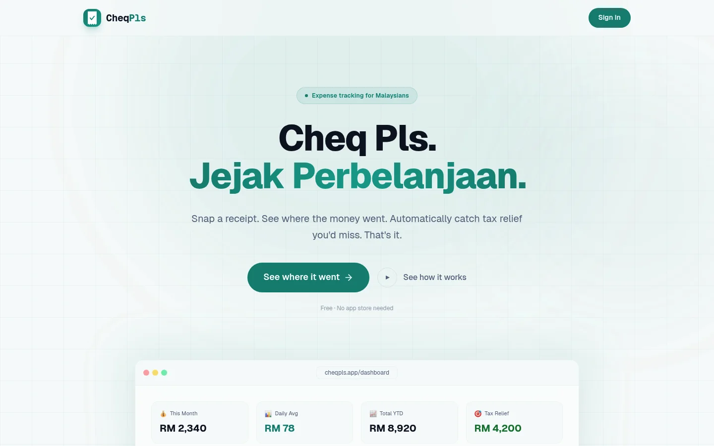
- Scan a receipt, get a categorised expense in under 5 seconds. Claude Haiku does the OCR — merchant, amount, date, and category all extracted in one pass. Twenty-nine categories, all mapped to how people actually spend in Malaysia (makan, petrol, groceries, bills, TNG top-ups) rather than generic global buckets.
- Bilingual throughout. Over 400 translation keys across every page. Malay and English, switch at any time. Category names translate too — “Groceries” becomes “Barang Dapur”. Language is the first thing asked during onboarding.
- Split a bill the right way. Snap the receipt, AI pulls the line items, tap the ones that are yours, and the SST + service charge get distributed proportionally. Even-split mode is there too — divide between any number of people. Nobody has to do the math.
- Tax relief as a bonus, not the pitch. The app quietly tracks spending that falls under LHDN relief categories against their caps. It never pretends to be tax advice — every surface says “estimates only, verify when filing.” Tax season becomes a glance at a screen instead of a shoebox of receipts.
- Installable on your phone. Works as a Progressive Web App — no app store, no update prompts. Android share-to-scan shortcut, offline-capable, 10 colour themes, dark/light, sound effects (off by default).
The engineering choices that matter
A handful of decisions shaped what the product actually is.
OCR accuracy versus storage cost
The naive approach to receipt OCR is resize-then-scan: shrink the image first to save bandwidth, then pass the small version to the model. That works for crisp printed receipts. It breaks on thermal paper, where every pixel of a faded digit matters and a single compression pass turns a legible total into a smudge.
The fix: send the full-resolution image to Claude for the OCR pass, then run Sharp over a separate copy (1200px wide, JPEG 75%) before that copy hits Supabase storage. Same accuracy on thermal and printed receipts. Around 10× less storage per scan — roughly 300KB instead of 3MB. The user never sees the trade-off. They just get accurate categorisation and a fast app.
Cost control baked in from day one
Every OCR call logs token usage to an api_usage table with per-user and per-day aggregation. Each endpoint is rate-limited to 30 scans per day per user. This is the difference between an AI feature you can afford to run indefinitely and one that bankrupts you the moment a post goes viral.
Compliance shipped with the product, not bolted on later
Before any public user touched it: PDPA-compliant privacy policy, Terms of Service, consent checkbox gating signup, magic-byte file validation on uploads, CORS middleware, signed URLs with rotation. The boring stuff most indie apps skip until they get a lawyer’s letter.
Latency
Deployed to Vercel’s Singapore region, matching Supabase’s region. Malaysian users get the app from a server next door in Singapore, not one on the other side of the world. Small thing, big feel.
Design and brand
I designed the brand from scratch. The mark is a receipt silhouette with a checkmark — a literal cheq pls. The wordmark is set in JetBrains Mono to evoke the monospaced feel of a till printout. Ten colour themes, each with light and dark variants.
The voice is dry, honest, and warm underneath. The landing page says “See where it went”. The footer says “Your spending. No commentary.” No exclamation marks. No “AI-powered” badges. No gamification language. No streaks, no medals, no confetti. Just the product.
Tax relief is explicitly positioned as estimates rather than advice — every surface reinforces this. It’s a feature that helps, not a promise that can get someone into trouble.
What shipping this required
One brain, end to end:
- Product design, interaction design, brand identity, landing page
- Full-stack build: Next.js App Router, Supabase (Postgres, Auth, Storage, Row-Level Security)
- AI integration with cost controls — OCR and line-item extraction, both rate-limited, both logged
- Market-specific engineering: LHDN categories, SST and service charge math, Malay translations, PWA behaviour on both Android and iOS Safari
- Security and compliance: PDPA, file validation, rate limits, signed URL rotation
- Deployment: custom domain on Cloudflare, Vercel region matching, environment management
- Ongoing operations: feedback form wired to an admin panel, tester access codes delivered via a one-click WhatsApp invite from the admin panel
CheqPls started as the app I wanted for myself. But every choice in it — the architecture, the cost controls, the compliance layer, the voice — is the kind of choice I bring to every project I take on. It’s proof that a one-person software shop can ship a product that feels like it came from a team of ten. That’s the bar.