The problem
The website is not an advert for the bar. At nine on a Friday, it is the menu.
Brian’s Bar is down a lit walkway off Cenang Street in Langkawi, behind a backpacker hostel. Tin roof, string bulbs, long shared tables, live music most nights. Sixty-two cocktails built out of Malaysian childhood — iced lime tea, rose milk, Milo — rebuilt with proper spirits.
There are QR codes on the tables. A customer scans one, and the page that loads is the menu. Not a preview of the menu, not a PDF of last season’s menu — the thing they order from. If it is slow, or a drink is missing, or it breaks at half past nine, the bar has no menu.
So this was never really a website job. It was a job where the deploy window matters, the owner has to be able to change a price himself, and 62 drinks have to be on the page every single time.
What I assumed — and what the bar taught me
Three assumptions. All three were wrong, and each one changed the build.
I assumed the photographs showed the bar. The homepage opened on a wide dusk shot of a white building with an old ferris wheel behind it. Brian looked at it and said the bar does not look like that any more.
He was right, and the reason I had missed it is embarrassing in hindsight: I had been sorting his photo library by file date, which only records when I saved them. Sorted by capture date instead, the newest pictures of the venue were from August 2025 and showed somewhere else entirely — a wooden bar counter, a forty-bottle back bar with the jiggers lined up, neon on corrugated iron. The site had been advertising a room they had moved out of.
The photograph was not out of date. The building was.
I assumed my own design brief described the place. The written direction said “warm dim speakeasy”. Then I read the venue’s own neon sign, which says BOXPACKERS, and looked at a photograph of a Friday night: young travellers packed under a corrugated roof at long communal tables. The cheapest cocktail is ten ringgit.
None of that is a speakeasy. It is a hostel garden bar that happens to make seriously good drinks, and the tension between those two things is the brand. Everything I designed before I noticed that was aimed at a room that does not exist.
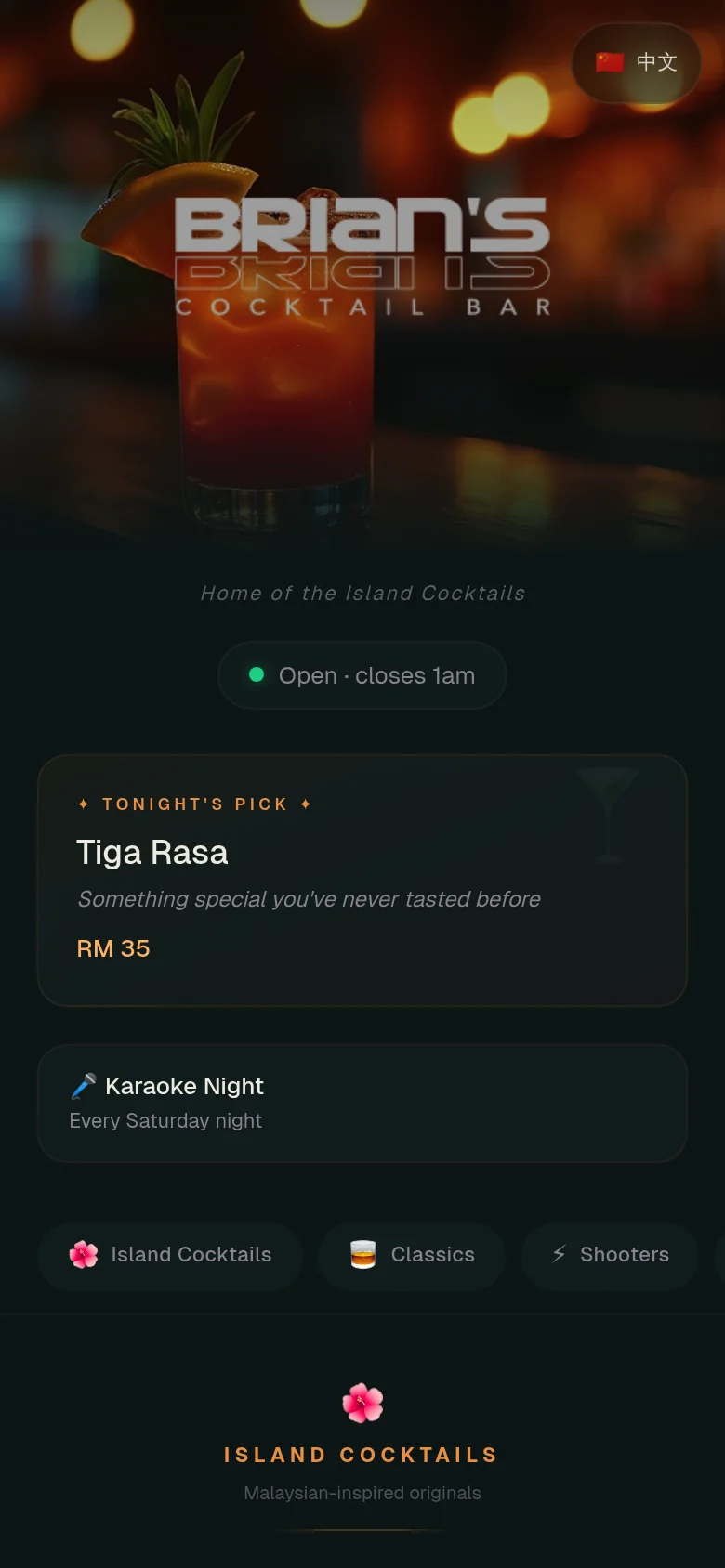
I assumed a menu card could carry a photograph. Brian has photographed four of his sixty-two drinks. On the old menu each card held its own picture, so a photographed drink stood about 380 pixels tall next to a text-only drink at about 90. Two columns of that tear open into ragged holes wherever a section does not divide evenly.
The fix was to stop asking one component to be two things. Photographs moved to a rail under each section heading; the list underneath keeps one shape for all 62 drinks. It also scales the right way — as Brian shoots more, the rail grows and the list never changes.
How I rebuilt it
A menu is a list. It had been built as a field of boxes.
The old menu spent about 190 pixels of a 390-point phone screen on filter controls — three permanent rows of them — before a single drink appeared. That is most of the first screen, on a page people open while standing at a bar.
It is now one band of 104 pixels: a search field, the categories, and a single Filters button carrying a count so an active filter is never hidden. Everything still works. It just stopped charging every customer for a feature most of them never touch.
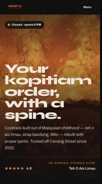
The bar’s own colours came out of the drinks rather than a brand deck — the amber of the tom yam cocktail in its skull glass, the pink of a rose milk, the green of a lime. Every text and background pair was measured against the accessibility standard before it shipped, because the room is genuinely dark and half the customers are reading on a cracked phone.
That measuring caught something I would otherwise have shipped. The brand amber is comfortable on a near-black screen, so I used it on the printed table stickers too. On white paper it scores 2.76 to 1 — close enough to invisible. The stickers now use the same colour held down to a printable weight, and the part that decides whether a phone can actually read the code sits at nearly 18 to 1.
What Brian got
The same tool he already knew how to use, with a site around it that shows the right room.
The admin panel he has been using for a year did not change. He still adds a drink, hides a category, marks something sold out, and it is on the public menu within seconds. When I hid a series he had already chosen to hide, the site stopped advertising it — the page follows him, not the other way round.
Before I swapped the old site for the new one I ran the whole check against a production build reading the live database, not a development copy: every drink, every price, every category, structured data for search engines, every route, every image. Then I did it again against the real domain after the swap. The whole thing took under a minute to deploy and could have been put back in seconds.
I did it in the afternoon, too. The bar opens at eight, and there is no version of this job where the menu is the thing you are debugging at half past nine on a Friday.
- Sixty-two drinks, live from his database, on a page that loads in a third of a second
- A menu shaped like a menu, readable one-handed in a dark room
- Link previews that show the drink instead of a building he left
- Table stickers that will actually scan when they are printed
- No monthly fee, no redeploy to rename a cocktail, and his data stays his